Overview
The premise
Spotify is the world's leading music platform — yet the experience reads as corporate utility: a black void of undifferentiated content competing for attention. It looks like a database where music is stored, not a place where creativity lives.
"Revolution" is the answer — a shift from database to Creative Sanctuary. Scope: a new brand direction, a color and type system built around emotion, and redesigned desktop and mobile surfaces, including a natural-language "ask for music" search and a rethought mobile core.
The problem
Three problems, compounding
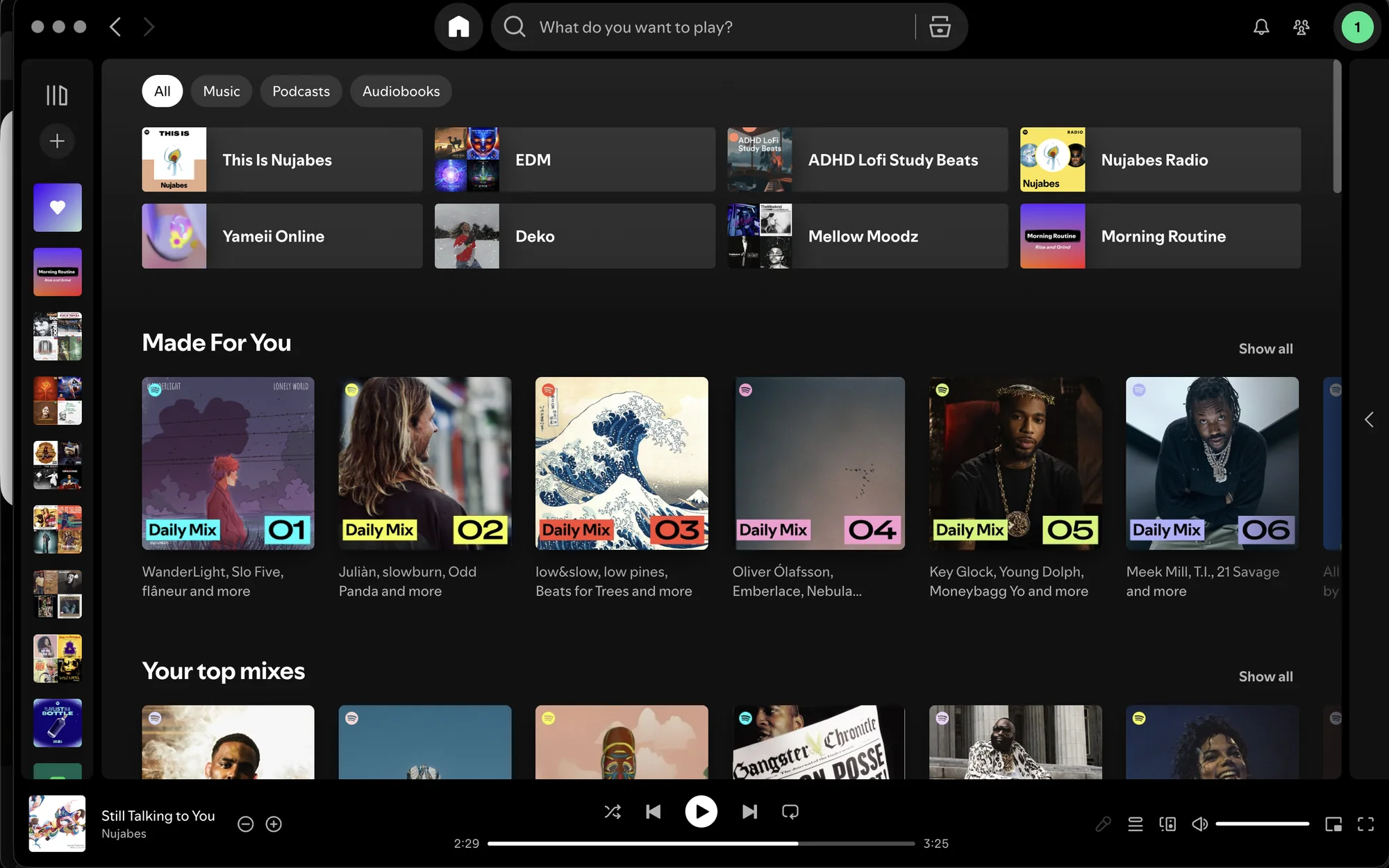
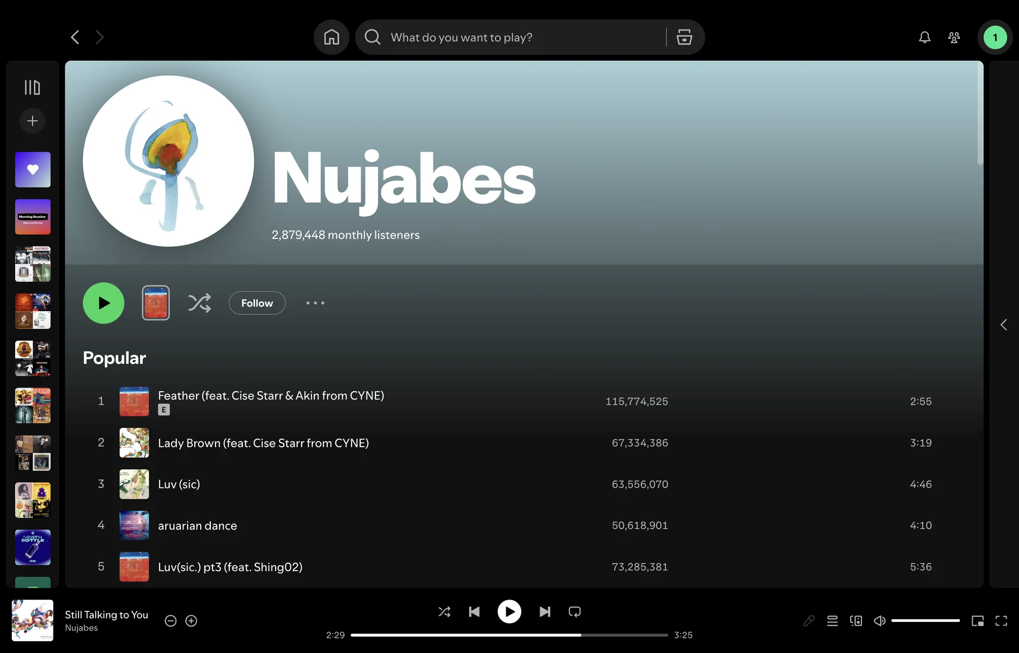
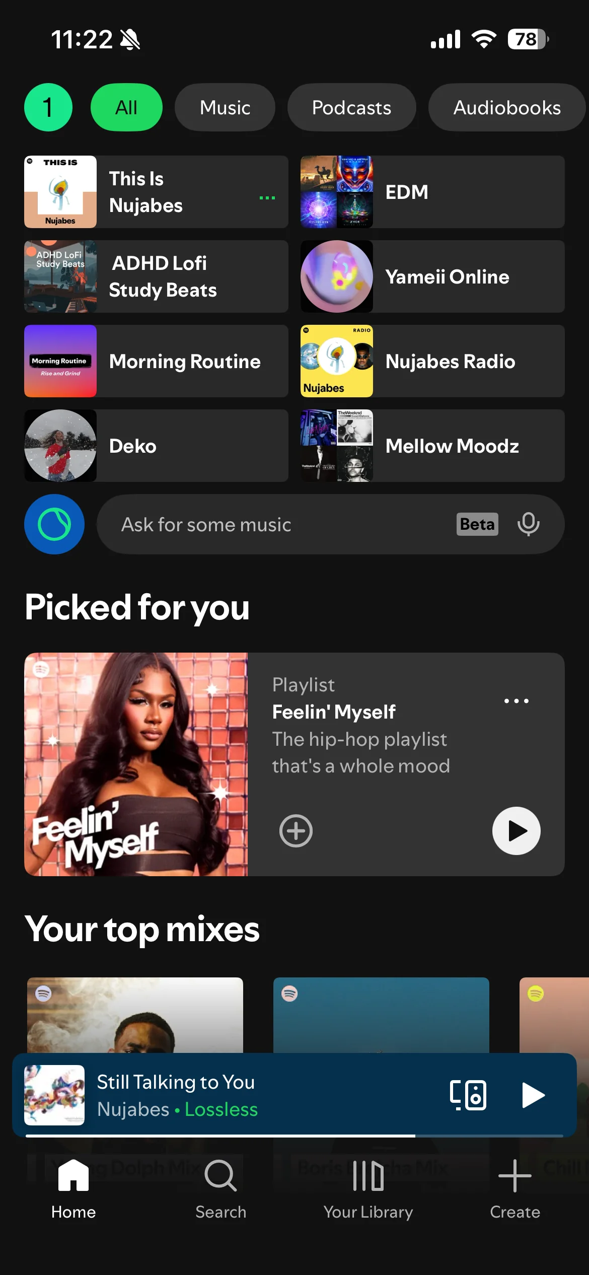
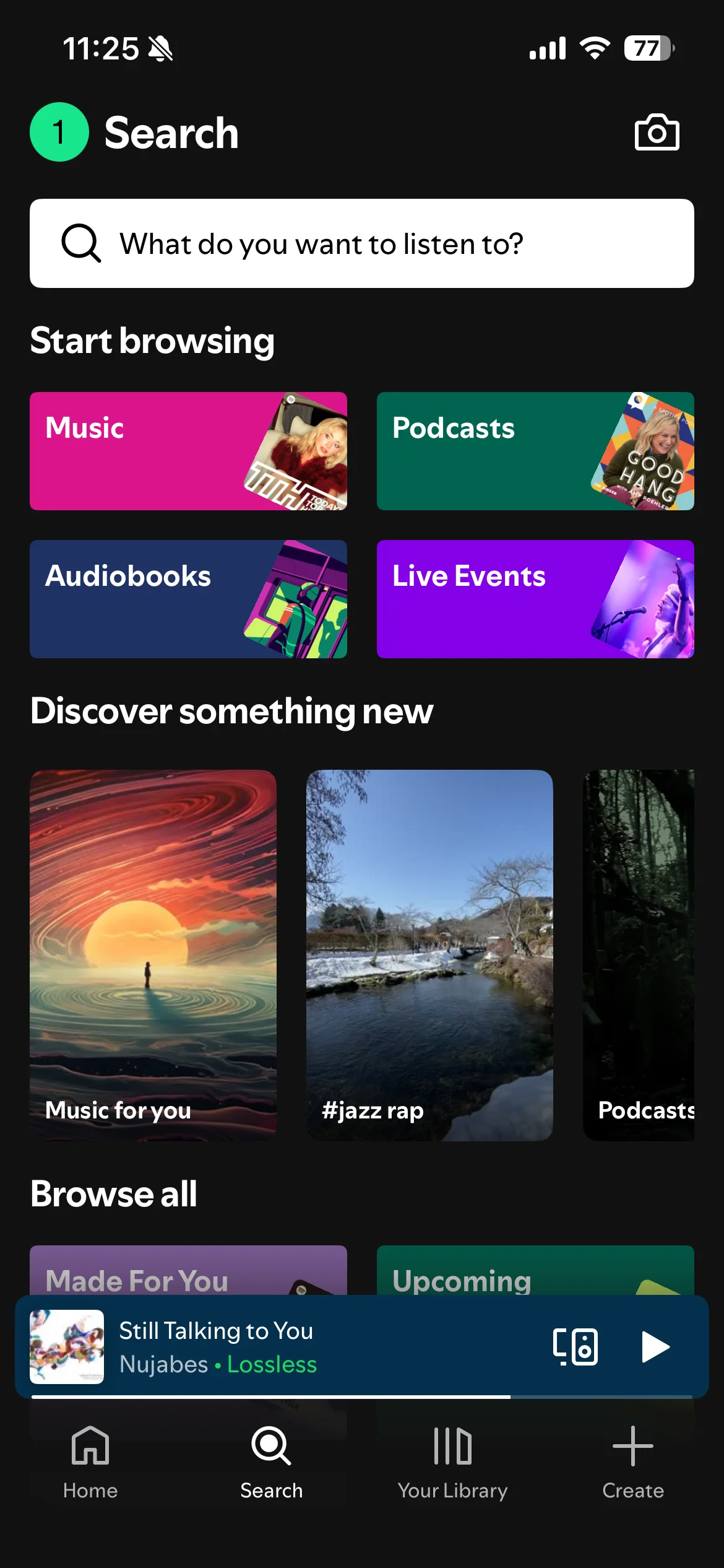
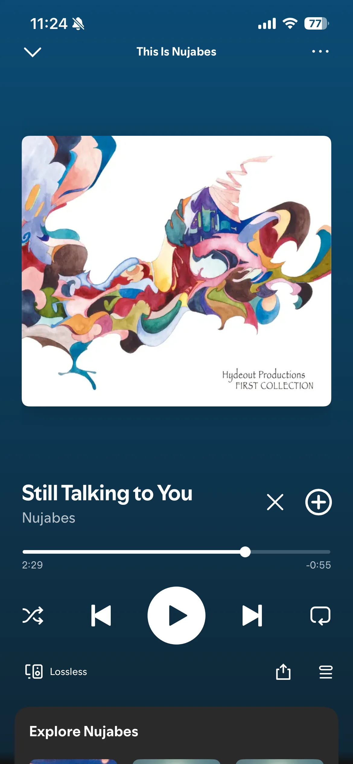
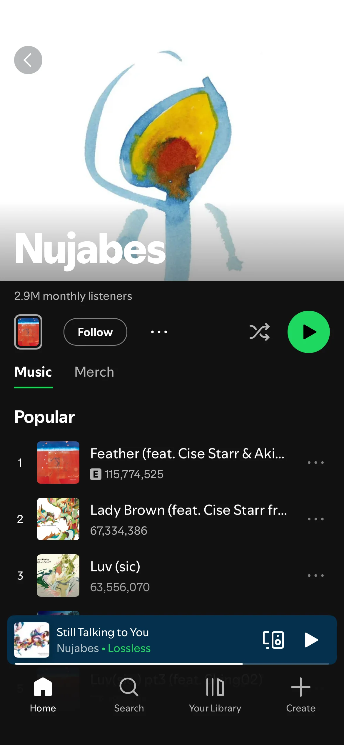
The Wifi-Signal Problem: the logo now reads like a connectivity icon, framing Spotify as a tech utility. The Database Problem: three persistent desktop panels compete at once and nothing breathes. The Activation Problem: a single high-contrast "Activation Green" on flat black reads as urgent — working against calm, immersive listening.
Desktop
Mobile
Brand Identity
Revolution over evolution
Two directions were explored: Evolution (the three iconic lines reframed as vinyl grooves) and Revolution (a complete departure). Revolution won.
It's a convergence mark — three emotional energies rising as a flame from a pair of headphones: Passion Red (#E8352A), Vitality Orange (#F2882A), and Joy Yellow (#F2C12A). It doesn't illustrate music; it illustrates what music does to people. The palette moves off the singular Activation Green and onto a deep-indigo foundation — the Creative Sanctuary (#241354) — with the three tones mapping to the artist, the listener, and the discovery that connects them.
Type gains a narrative layer: Plus Jakarta Sans for expressive headings, Spotify Mix retained for interface and metadata.


Color as emotional intent
The palette moves off the singular "Activation Green" and into a spectrum of human emotion, grounded on a deep-indigo sanctuary.
The Creative Sanctuary
#241354
Foundation — the deep, immersive base.
Passion Red
#E8352A
The intensity of live performance — the artist.
Vitality Orange
#F2882A
The energetic bridge between music and listener.
Joy Yellow
#F2C12A
The uplifting payoff of discovery.
The three tones map to the content pillars of the ecosystem — the artist, the listener, and the discovery that connects them.
Typography — a narrative hierarchy
Plus Jakarta Sans brings an editorial voice to the brand's narrative layers; Spotify Mix is retained for interface and metadata.
Plus Jakarta Sans
Primary · Headings
- Heading 1
- 64px · −2% · 1.1em
- Heading 2
- 32px · −1% · 1.2em
Spotify Mix
Secondary · Body · Interface
- Body
- 18px · 0% · 1.5em
Specimen shown in Inter — Spotify Mix is a proprietary typeface.
The Redesign
From database to sanctuary
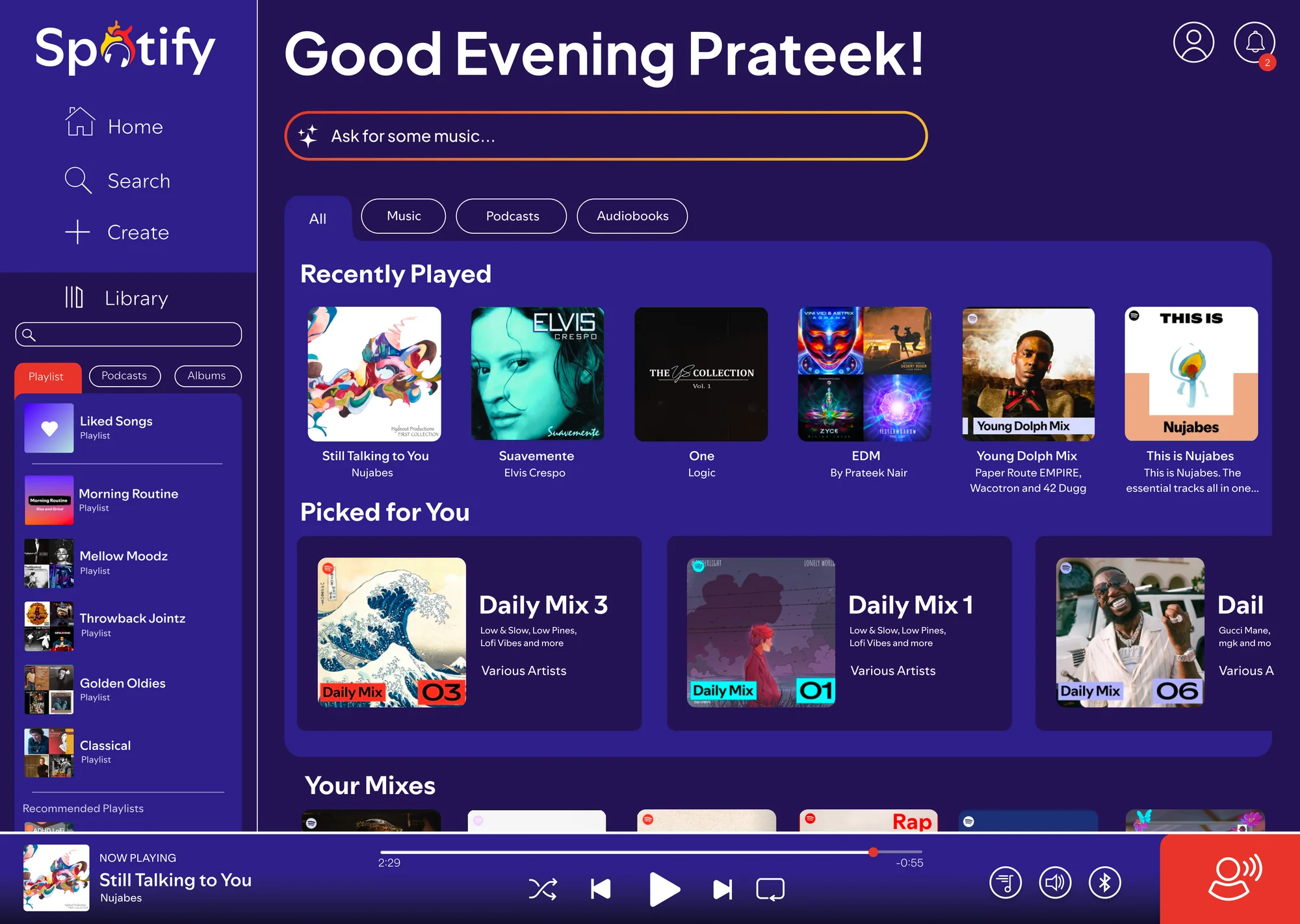
The redesign trades metadata density for content depth — a focused, immersive environment that lets the artist's work breathe.
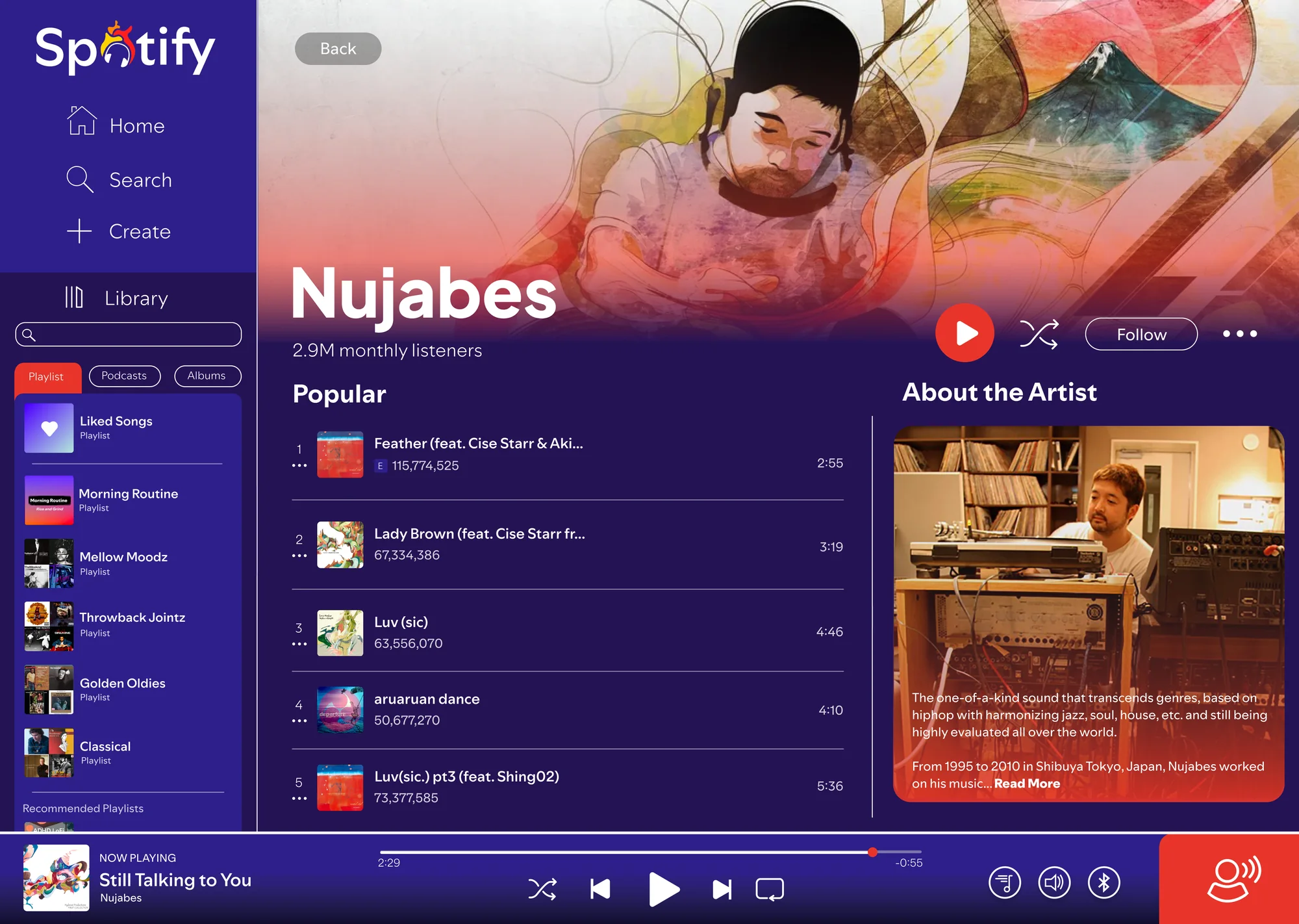
Artist, reframed
Artist pages pull dynamic background gradients from the Revolution palette to match the mood and energy of the music, and large-scale Plus Jakarta Sans sets a clear hierarchy that guides the listener's journey.
The Mobile Pulse
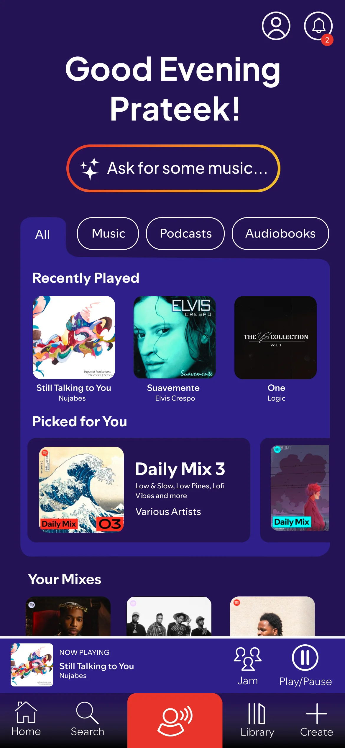
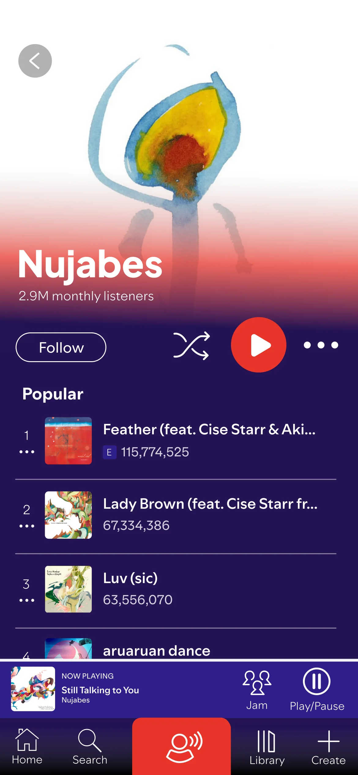
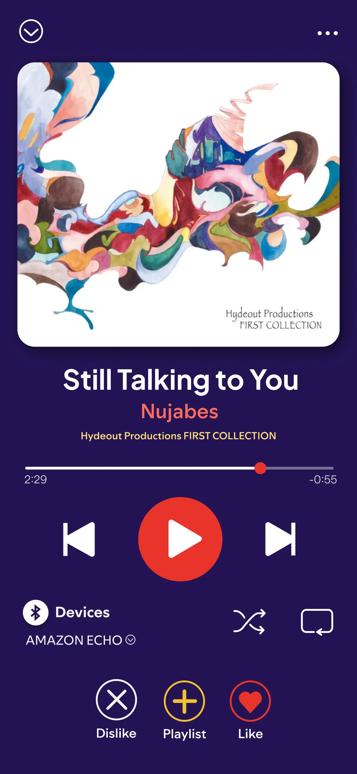
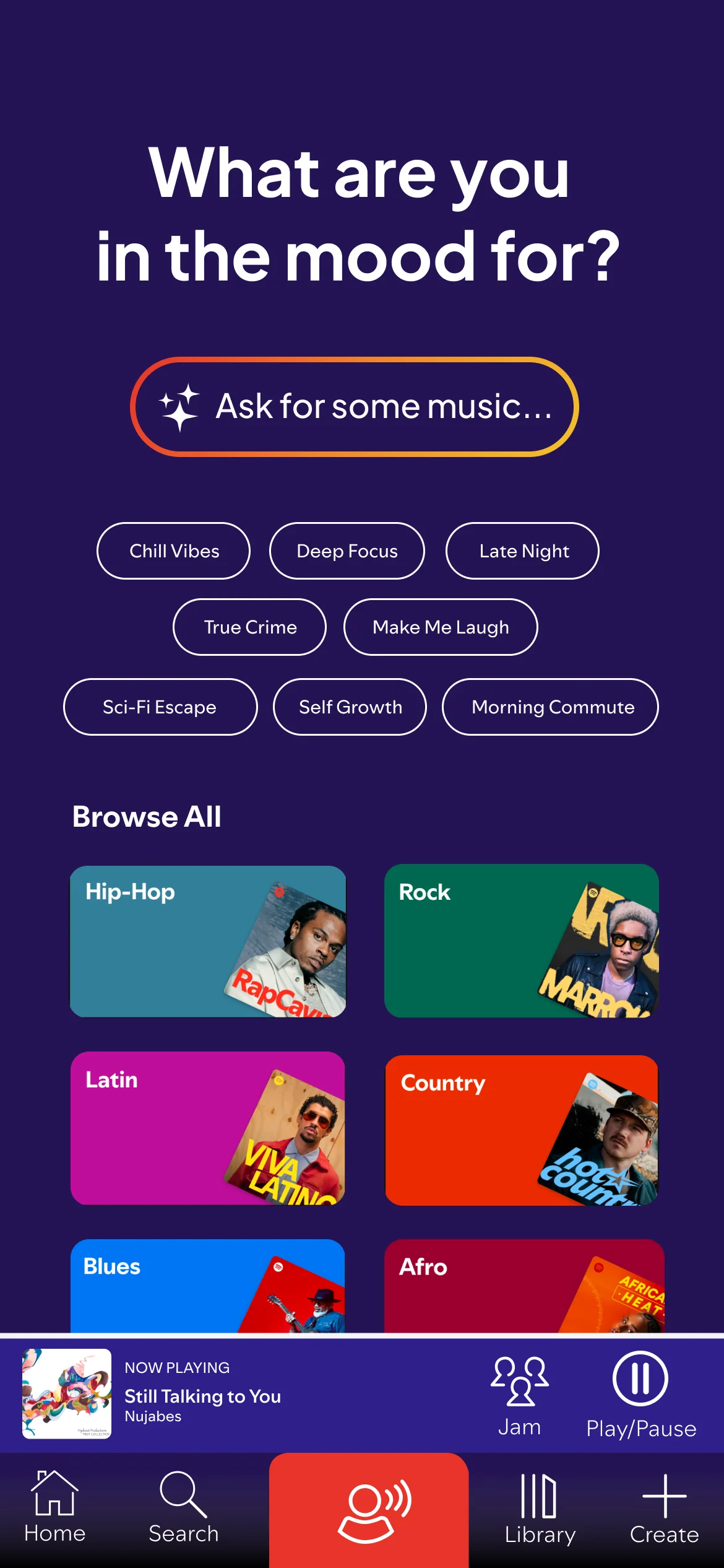
Two ways in: ask, or the Flame anchor
Natural-language search lets you describe the mood you're after — "ask for some music" — meeting discovery where it already happens instead of bolting on a separate AI surface. And the center of the mobile bar isn't a static play button: it's the Flame anchor, a fully customizable shortcut you map to your most frequent habit — shuffle Liked Songs, open a podcast, or jump into a live session.
Before & After
Side by side
Methodology & reflection
What I took away
Built entirely from scratch — no UI kits, templates, or pre-existing assets — so every pixel serves the new mission rather than inheriting the old one's technical debt. Decisions were stress-tested from both sides before the final call.
Challenge
Making Spotify look like a place where human creativity lives, without throwing away the equity of a globally recognized identity.
Decision
Choosing Revolution over Evolution — a convergence mark that states the mission instead of decorating it.
Speculative Innovations
The Flame anchor and dynamic gradient system are proof-of-concept — next, prototype the anchor's full flow and stress-test the gradients across genres.