Overview
The premise
Since the Intuit acquisition in 2021, Mailchimp reframed its voice around platform credibility and enterprise ambition — quietly trading away the down-to-earth warmth that made small businesses trust it in the first place.
The Homecoming doesn't invent a new identity. It argues that Mailchimp already had the right one and forgot to look like it — then brings Freddie, and the brand's original colors, home. Scope: brand strategy, a returned color and type system, and three production screens, all built from scratch in a single sprint.
The problem
The soul left the building
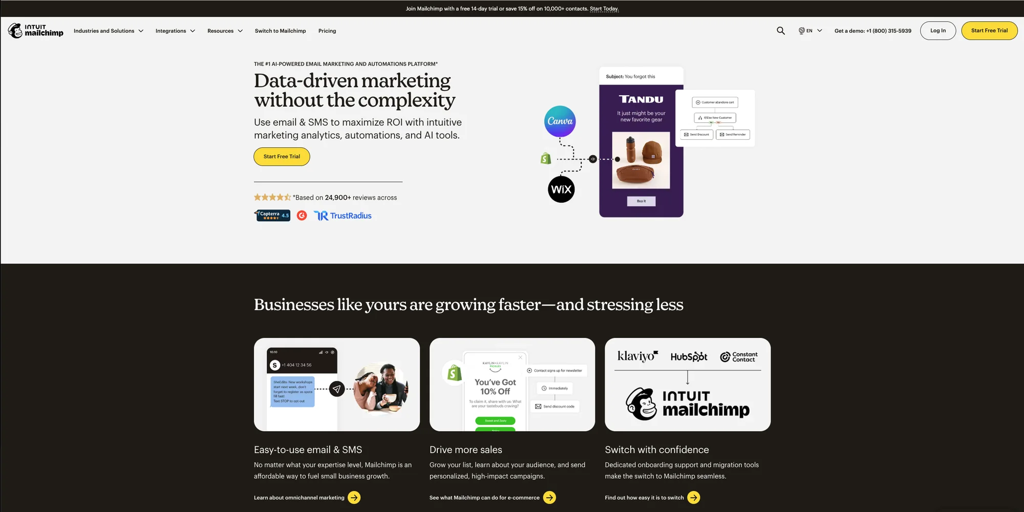
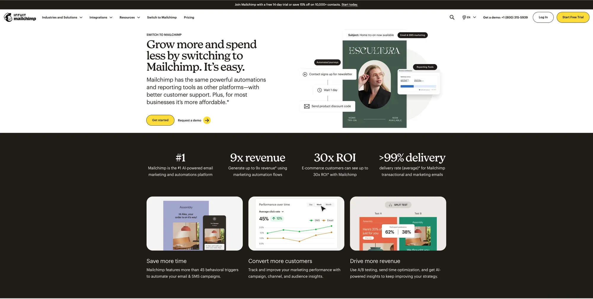
The visual system is technically intact, but the warmth is gone. Today's homepage sells the platform with a corporate headline, ROI proof points, and an enterprise-defensive layout; the Switch page negotiates with a dense stat block. Neither sounds like it was built for the small business owner it's meant to serve.
Brand Identity
Brown and blue were always Freddie's colors
The direction was locked before building began: keep Freddie, retain the wink, and return his colors to their origins.
Cavendish Yellow — introduced by COLLINS in 2018 — is retired. Freddie's fur goes back to Heritage Brown (#3D2314) and his hat to Confident Blue (#1B3A6B) — the same family as Intuit's navy, but warmer and more human. Creative Purple (#6B3FA0) becomes the activation color, appearing only when something creative is happening. Four colors, four defined roles, zero ambiguity: blue means move, purple means make.
Montserrat is pushed to an editorial extreme for headlines and CTAs; Source Sans 3 carries body and UI — a voice that reads like a small business owner wrote it, but an engineer made sure it worked.

Logo suite
The mascot, the horizontal lockup, and the standalone envelope — one family, returned to Freddie's original colors.



Color system
Each color carries a defined emotional role and a usage rule — they communicate, they don't decorate.
Heritage Brown
#3D2314
Foundation · hero sections · the anchor.
Confident Blue
#1B3A6B
Container · the Intuit Bridge.
Creative Purple
#6B3FA0
Creative activation — appears when it means something.
Founder's White
#F5EFE8
The base — where content lives.
Brim Blue
#4A8AC4
Universal button fill on warm surfaces.
Cavendish Yellow
#FFE01B
The COLLINS-era accent, retired in this system.
RetiredBlue means
Move.
Log In · Start Free · Make the Switch · View Report · Save Draft
Every action that moves you through the product.
Purple means
Make.
Create Campaign · Start Writing · Publish · Design Your Email
Every action that begins a creative process.
Typography
Montserrat pushed to an editorial extreme, with Source Sans 3 carrying the utility.
Montserrat
Primary · Headlines · CTAs · Brand
- Weight
- Black / 900
- Scale
- 80–120px display
- Tracking
- −0.05 to −0.08em
Source Sans 3
Secondary · Body · UI text · Labels
- Weight
- Regular / 400
- Scale
- 16–18px body
- Tracking
- Normal
The Redesign
Three screens, three arguments
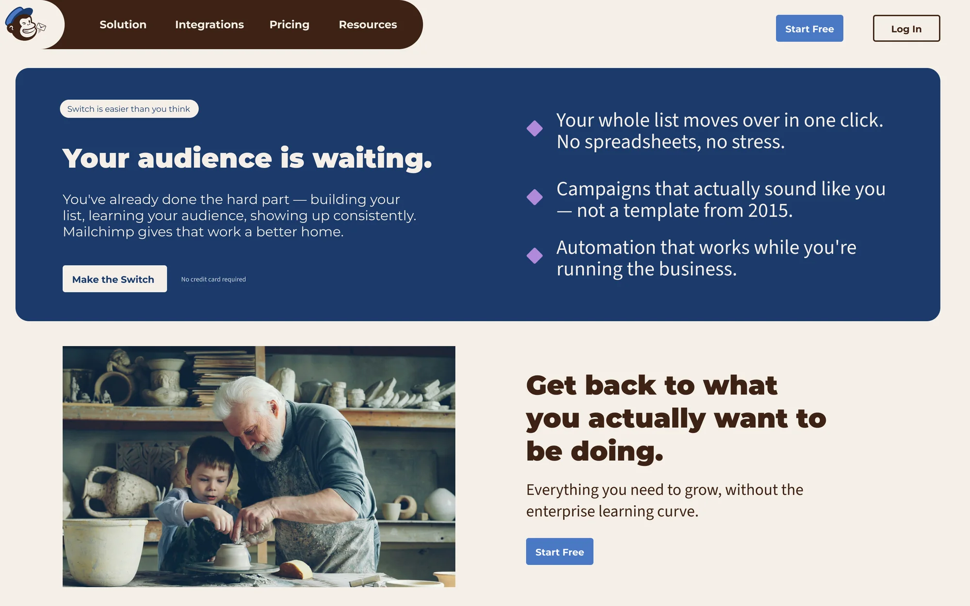
Each screen makes a different case for the rebrand — recommitment, confidence, and intimacy — and every pixel was built from scratch, no templates or UI kits.
Switch to Mailchimp — Confidence
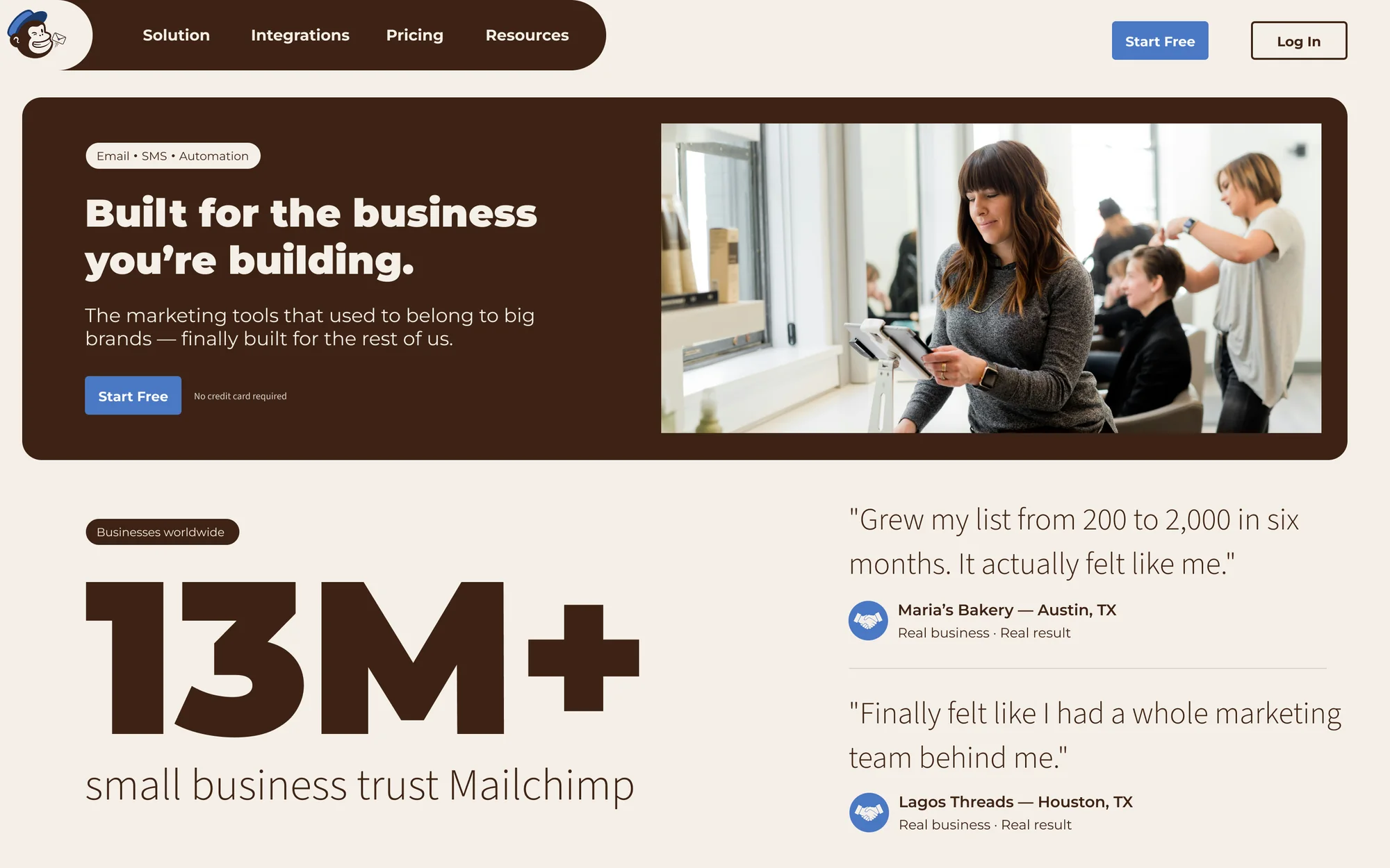
Confident Blue dominant, one emotional argument: "Your audience is waiting." Three diamond bullets stand in for a dense feature-and-price table. The page declares rather than negotiates.
Mobile Email Builder — Intimacy
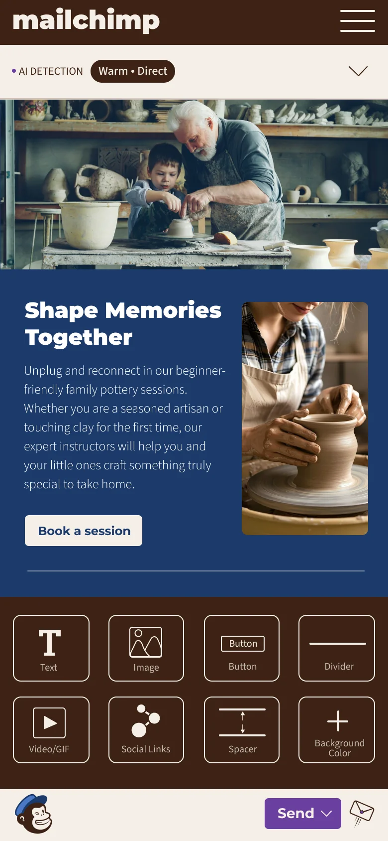
The core product moment. An AI Mood Detection panel reads your tone (“Warm · Direct”) before you send, the block palette keeps composition to a single column of decisions, and the purple Send button treats sending as the culminating creative act — Creative Purple earning its role as the catalyst rather than decorating the screen.
Before & After
Side by side
Methodology & reflection
What I took away
Built entirely from scratch — no UI kits or templates — with every primary text pairing held to WCAG 2.1 AAA. Decisions were stress-tested from both sides before the final call.
Challenge
Recommitting to humanity inside a product that's been corporatized — without pretending the Intuit acquisition never happened.
Decision
Making the mascot work. Freddie goes back to his Heritage Brown fur and Confident Blue hat and picks up an active prop, which turns him from a decorative element into a mascot with intention.
Speculative Innovations
Creative Purple activation is proof-of-concept and worth prototyping in a live builder. An approval-state system for Freddie — his expression signalling Ready to Send or Something’s Off — was scoped and never built; the rebrand stopped at the identity.